Despite their support for the federal government, U.S. Immigration and Customs Enforcement (ICE) has been kicked off the Christmas invitation list along with everyone else.
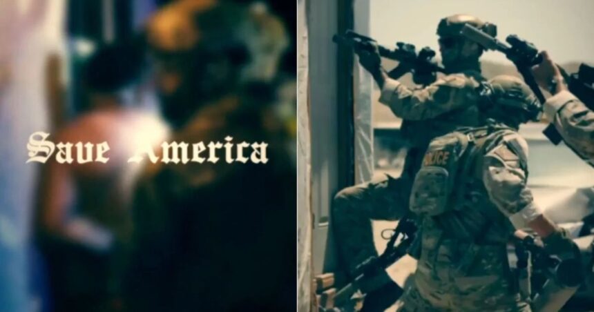
ICE is being heavily criticized once more. But not for their arrest or deportation strategies this time. Following the release of a recruitment video featuring an image of Nazi propaganda by ICE, there was a response. The typeface used in the video has a strong association with propaganda from the Nazi era.
Viewers and internet users immediately noted that the title text of the video was written in blackletter. This typeface is quite similar to the Fraktur typeface used in Adolf Hitler’s Mein Kampf and in a number of other Nazi propaganda works.
The goal of the film was to persuade prospective applicants to apply to ICE. Earlier this week, it was shared on government websites and social media. Although the video’s message is highly inflammatory in and of itself, the font selection has drawn more notice this time.
In addition to attempting to convey a message about national security and law enforcement, the video is also thought to be transmitting a negative message. It has been said that the design choice is historically loaded and tone-deaf.
The most recent video advertisement for joining ICE employs a font that is identical to the one used by Nazis, Fraktur, although I didn’t notice this yesterday. FHsFKQb27C 1/pic.twitter.com
August 11, 2025, Grant Hermes (@GrantHermes)
Fraktur and other blackletter types were historically common in German printing. But the Nazis had fully embraced the look by the 1930s. They marketed it as a representation of German culture and customs. Hitler’s own writings, propaganda posters, and official papers all made extensive use of the typeface.
But the Nazi government suddenly stopped using the typeface in 1941. They replaced it with more contemporary Roman-style fonts and called it Judenlettern, or Jewish letters. The connection between blackletter and Nazi propaganda has endured despite their best efforts to disassociate themselves from their previous belief.
These days, blackletter fonts are frequently employed in discussions about everything from extreme group insignia to heavy metal album covers. These settings support the idea that it represents violence or authoritarianism.
Social media users, typographers, and historians have all offered their opinions on the dispute. The Nazi-esque lettering is horrible, but the video’s iconography is also problematic, according to Princeton history professor Nate Ledbetter. Cultural memory is carried by fonts, and this one is full of it.
Others have noted that even while blackletter was not officially accepted by the movement or used only by Nazis, many nevertheless associate it too strongly with authoritarian regimes and the ideology they promote. People of color should avoid the US as much as possible since, as I mentioned, the current administration is being criticized for its controversial immigration policy.
The criticism of ICE’s font selection demonstrates the reality of communication and design. A seemingly insignificant aesthetic choice can have a big impact, especially on the message. Symbols, colors, and fonts are culturally loaded. References and history are inextricably linked to anything so profound.
The way that ICE handles immigration raids, deportations, and detention procedures is frequently questioned. The choice to employ a historically fraught typeface in this context is undoubtedly foolish and ought not to have been made.
Opponents contend that these omissions fuel the impression of insensitivity or even animosity against marginalized groups.